G-Graphic: Rebrand
BRAND DESIGN | COPYWRITING | ART DIRECTION | PRODUCTION | WEB DESIGN
I led the internal rebrand of the award winning agency, creating a visual mission statement, strategy, and clear direction that is in-line with the company’s core values.
This included designing a new logo, messaging framework and accompanying design assets, as well as managing a team of four creatives to design and develop phase 1 of the new website and marketing collateral. Alongside this I art directed the agency showreel video and devised their marketing strategy.
Your Creative Lens
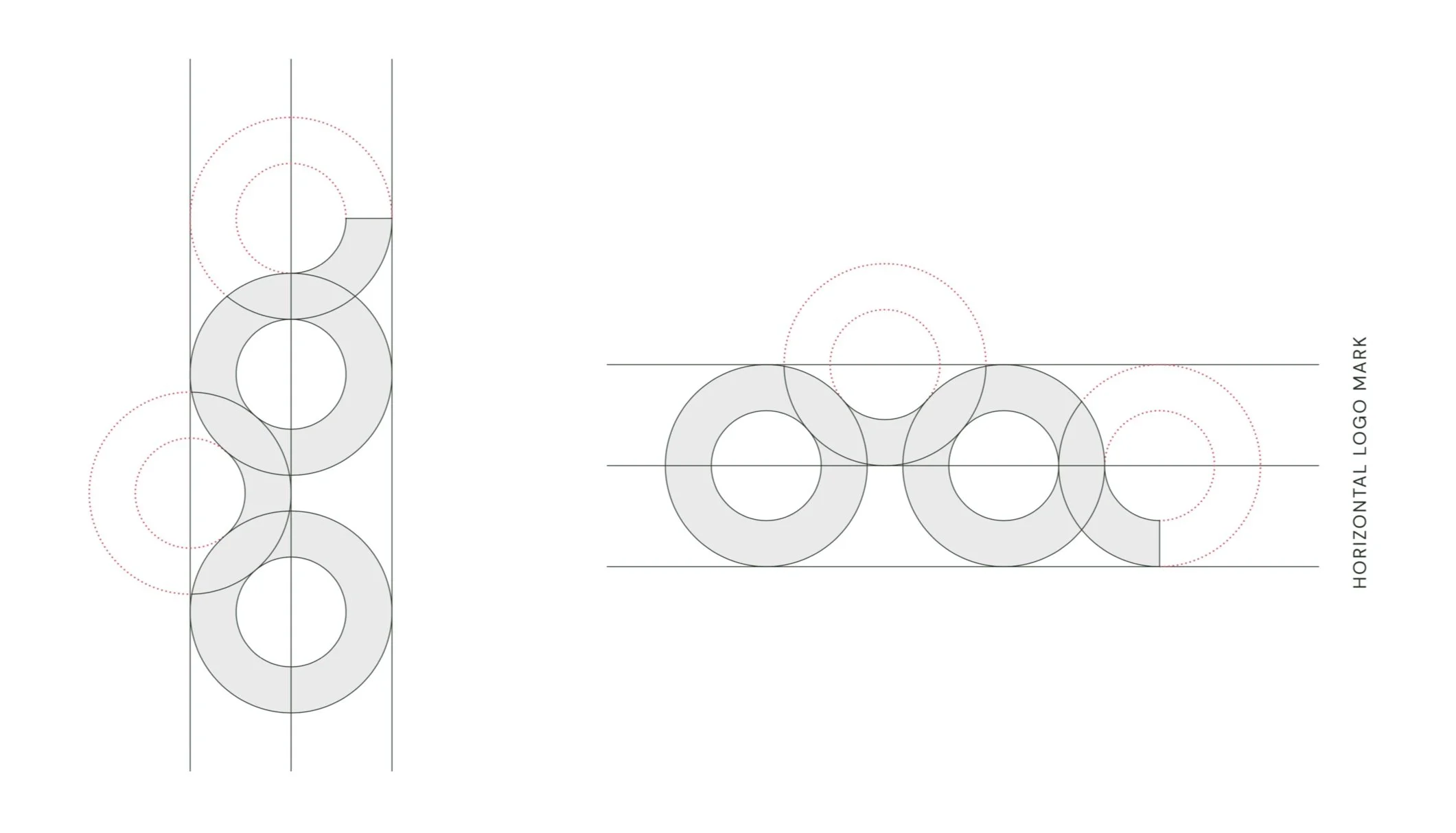
The ‘spectacles’ style logo design is a direct nod to the inquisitive, reactive and visually orientated nature of the agency.
When in horizontal format the logo symbolises the creative lens in which the G-Graphic team sees the world through. Using accompanying horizontal & vertical text the branding plays with the dual meaning of the ‘g’ logomark.


